Welcome to the June edition of the Ink & Inspiration Blog Hop!
Our theme this month is MASCULINE! It is always so hard to come up with a wonderful card to celebrate the men in our lives, isn’t it. They really don’t want all the lace and the pearls. But, they do appreciate a well-made, handmade card. So, where are my offerings for you…
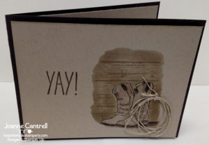
This card was made using the Country Livin’ set (141922/141925) on page 144 of the current catalog. It’s a great set that is very masculine. The YAY! is from the Oh Happy Day Card Kit (142725) on page 15. Once you’ve done the kit, the stamp set is so versatile that you won’t ever put it away! I used a bit of Linen Thread to add the rope.
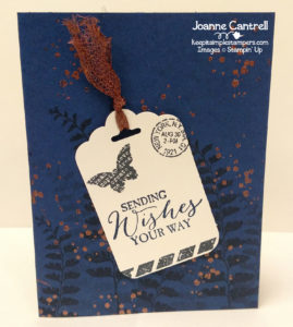
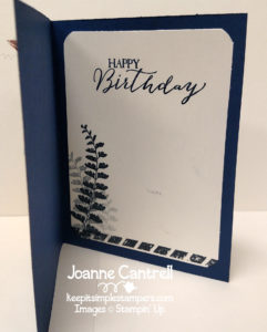
This card uses a set that many may not thing to pull out for a masculine card: Butterfly Basics (138813/138816/137154 pg. 149). I mean, butterflies aren’t very manly… maybe a moth… but not a butterfly.. right! But, it’s all in the color scheme. This one uses Night of Navy, Basic Black, and Very Vanilla with accents in Copper. The copper embossing adds a unique touch. The splatter can be found in Painter’s Palette (141907/141910 pg. 160). Oh – and round corners is still easy even without the corner rounder punch. I used the 3/4″ Circle Punch (199873 pg. 207) to round these… simply slip the corner of the paper thru the top of the punch – when you are holding it upside down.
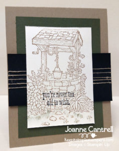
Bet you thought that wishing well was very pretty and your mom would love a card with it! Well, so would your father. Again – it goes back to choosing the right colors. The well and sentiment are from the Bright Wishes (143823/143827) set found on page 91. I used my aqua painter with lightly color the grass.
And finally – I love this card…
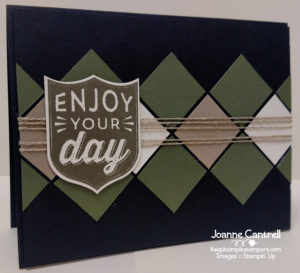
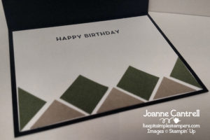
Very simple and very masculine. I will mention it one more… It’s all about color. This card uses the same colors as the card above: Always Artichoke, Crumb Cake, Very Vanilla, and Basic Black. The argyle is down using 1″ squares. The badge is from Badges & Banners (141605/141610 pg. 26) and punched using the Best Badge punch (140633 pg. 206). The inside sentiment is from Big on Birthdays (142877 pg. 73). I think this is the perfect font for a manly sentiment.
Well, thank you for stopping by today!
On to the next…
Until next time… keep it simple, Stampers!
🙂 Joanne
Wow! Another great selection of cards! Love your style! xx
Aww.. Thanks, Jessie. You are so sweet!
Lovely cards Joanne, great colour choices!
Thanks, Steph! I think color choice is almost as important as the stamp set when deciding to make a card!!!
Wow what a selection! My favourite would have to be the Argyle card. May I CASE this card please (& refer back to you of course)? Amazing.
Of course you can CASE my cards! I love it when people do that!!!
WOW! You have been super busy! Great cards all of them!
Thanks, Sandra… Not busy when it’s a work you love! 🙂
I really like your Enjoy Your Day diagonally patterned card! Really great ideas! Thanks for sharing 🙂
Thanks, Lorin!!! I hope I get to see what you CASE from that card!
Great cards, Joanne! I especially love the last one. Great background pattern for a masculine card!
Thanks, Sarah! It would equally work for a feminine card in a different color scheme!
Great colour combinations! Your argyle card is amazing Joanne! xx
Thanks, Angela! I love it too!
Wow, Joanne! All of your cards are terrific but I especially like the geometric design. Very well done! -Jenny
Thanks, Jenny! That one is my favorite too!